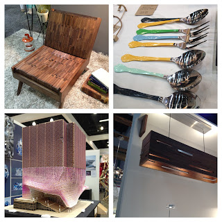
(from left to right // top to bottom)
1. that wooden one person seater is the most comfortable thing my bottom has ever sat on: it's made up of individually loose blocks of wood over cushioning. Think wood meets Tempurpedic.
2. Vintage serving utensils with painting handles. Isn't this the best idea ever!? Martha Stewart has an amazing selection of craft paints at Michael's.
3. Mini model of 3D on 3D. Remember those childhood 3D books? Add that to some rad architecture and there you got it...the future
4. I love fun storage solutions.

1. Some intense neck candy
2. Yummy patio furniture
3. T E X T U R E


we obviously couldn't resist taking a photo in front of dwell's backdrop ;)
and of course after exploring the show for hours we were all extremely hungry...so we hit up the Kitchen... Mac n Cheese with crusted gruyere... I died a little. Buttermilk chicken: crave worthy.
and of course after exploring the show for hours we were all extremely hungry...so we hit up the Kitchen... Mac n Cheese with crusted gruyere... I died a little. Buttermilk chicken: crave worthy.

Awe that was such a fun day! Great post, it brought back some fond memories, like it was soo long ago right :) xx N
ReplyDelete